<!DOCTYPE html>
<html lang="en">
    <head>
        <meta charset="UTF-8" />
        <meta http-equiv="X-UA-Compatible" content="IE=edge" />
        <meta name="viewport" content="width=device-width, initial-scale=1.0" />
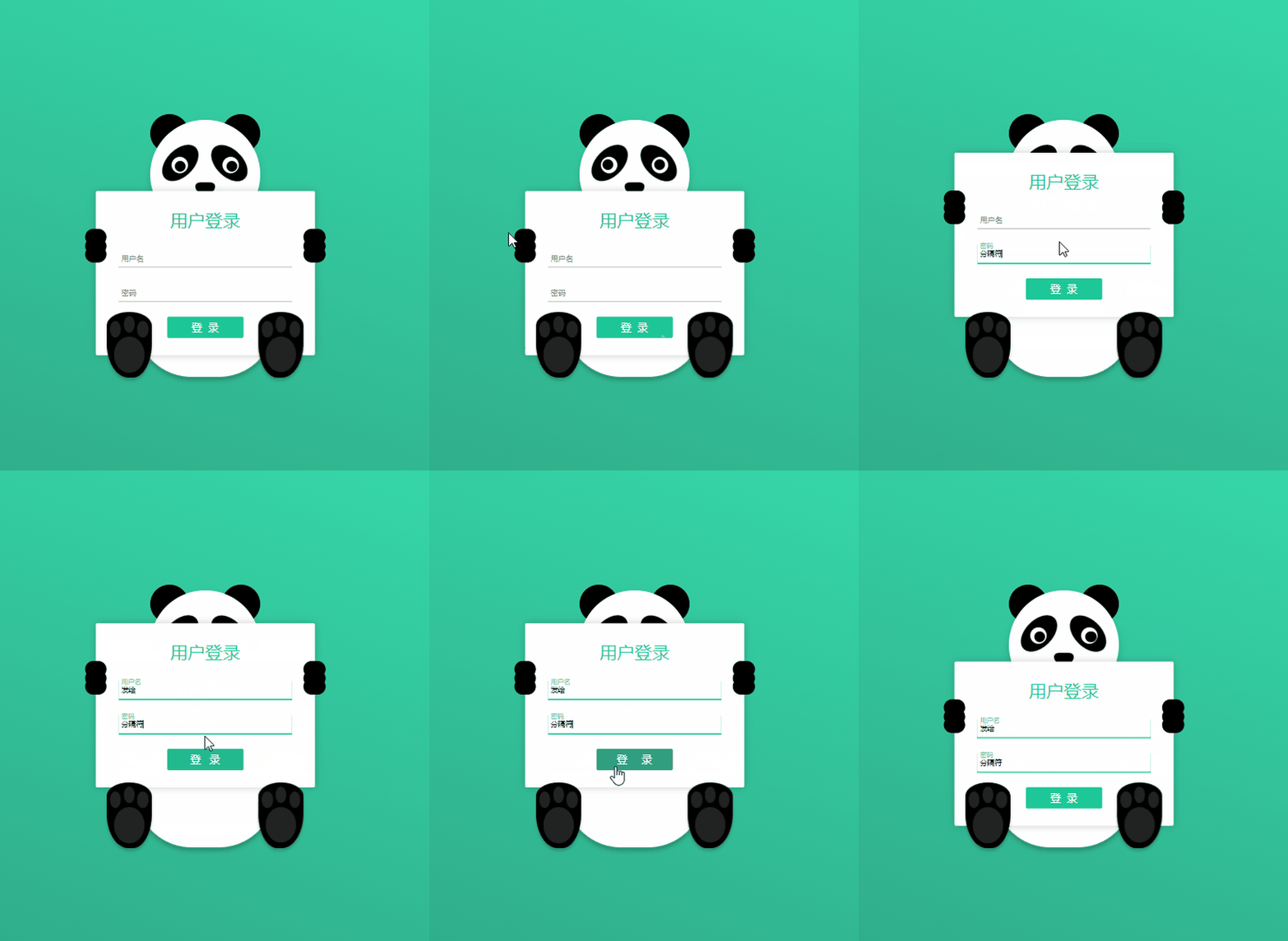
        <title>可爱的熊猫遮掩登录界面</title>
    </head>
    <style>
        * {
            margin: 0;
            padding: 0;
            box-sizing: border-box;
        }
        .wrap {
            height: 100vh;
            display: flex;
            justify-content: center;
            align-items: center;
            background: linear-gradient(200deg, #37e2b2, #2fa080);
        }
        .container {
            /* border: 1px solid red; */
        }
        .panda {
            position: relative;
            width: 200px;
        }
        .face {
            width: 200px;
            height: 200px;
            background-color: #fff;
            border-radius: 100%;
            box-shadow: 0 10px 15px rgba(0, 0, 0, 0.15);
            position: relative;
            z-index: 1;
        }
        .ear {
            width: 70px;
            height: 70px;
            background-color: #000;
            border-radius: 100%;
            position: absolute;
            top: -10px;
        }
        .ear.right {
            right: 0;
        }
        .eye-shadow {
            width: 50px;
            height: 80px;
            background-color: #000;
            border-radius: 50%;
            position: absolute;
            top: 40px;
        }
        .eye-shadow.left {
            transform: rotate(45deg);
            left: 30px;
        }
        .eye-shadow.right {
            right: 30px;
            transform: rotate(-45deg);
        }
        .eye-white {
            width: 30px;
            height: 30px;
            background-color: #fff;
            border-radius: 100%;
            position: absolute;
            top: 68px;
        }
        .eye-white.left {
            left: 38px;
        }
        .eye-white.right {
            right: 38px;
        }
        .eye-ball {
            width: 20px;
            height: 20px;
            background-color: #000;
            border-radius: 100%;
            position: absolute;
            left: 5px;
            top: 5px;
        }
        .nose {
            width: 35px;
            height: 20px;
            background-color: #000;
            position: absolute;
            left: 0;
            right: 0;
            margin: auto;
            /* left: 50%;
            transform: translateX(-50%); */
            bottom: 65px;
            border-radius: 42px 42px 60px 60px / 30px 30px 60px 60px;
        }
        .mouth {
            width: 68px;
            height: 25px;
            border-bottom: 7px solid #000;
            border-radius: 50%;
            position: absolute;
            left: 0;
            right: 0;
            margin: auto;
            bottom: 35px;
        }
        .body {
            width: 250px;
            height: 280px;
            background-color: #fff;
            position: relative;
            left: -25px;
            top: -10px;
            border-radius: 100px 100px 100px 100px / 126px 126px 96px 96px;
            box-shadow: 0 5px 10px rgba(0, 0, 0, 0.3);
        }
        .foot {
            width: 82px;
            height: 120px;
            background-color: #000;
            position: absolute;
            bottom: 8px;
            z-index: 3;
            border-radius: 40px 40px 35px 40px / 25px 26px 63px 63px;
            box-shadow: 0 5px 5px rgba(0, 0, 0, 0.2);
        }
        .foot.left {
            left: -80px;
        }
        .foot.right {
            right: -80px;
            transform: rotateY(180deg);
        }
        .foot::after {
            content: '';
            width: 55px;
            height: 65px;
            background-color: #222;
            position: absolute;
            border-radius: 50%;
            left: 0;
            right: 0;
            margin: auto;
            bottom: 10px;
        }
        .foot .sole,
        .foot .sole::before,
        .foot .sole::after {
            width: 20px;
            height: 30px;
            background-color: #222;
            position: absolute;
            border-radius: 50%;
            left: 0;
            right: 0;
            margin: auto;
            top: 8px;
        }
        .foot .sole::before {
            content: '';
            left: -50px;
        }
        .foot .sole::after {
            content: '';
            left: 25px;
        }
        .hand,
        .hand::after,
        .hand::before {
            width: 40px;
            height: 30px;
            background-color: #000;
            border-radius: 50px;
            position: absolute;
            top: 70px;
            /* left: -20px; */
        }
        .hand.left {
            left: -20px;
        }
        .hand.right {
            right: -20px;
        }
        .hand::before {
            top: 16px;
            left: 0;
            content: '';
        }
        .hand::after {
            top: 32px;
            left: 0;
            content: '';
        }
        .login-box {
            width: 400px;
            height: 300px;
            background-color: #fff;
            border-radius: 3px;
            box-shadow: 0 0 15px rgba(0, 0, 0, 0.2);
            position: absolute;
            left: 50%;
            top: 50%;
            transform: translate(-50%, -110px);
            z-index: 2;
            display: flex;
            justify-content: center;
            align-items: center;
            flex-direction: column;
            transition: 0.3s;
        }
        h1 {
            color: #1dc797;
            font-weight: normal;
            margin-bottom: 5px;
        }
        .ipt-box {
            width: 80%;
            margin-top: 25px;
            border: 1px solid transparent;
            position: relative;
        }
        .ipt-box input {
            width: 100%;
            height: 35px;
            border: none;
            border-bottom: 1px solid #bbb;
            text-indent: 5px;
            outline: none;
            transition: 0.3s;
        }
        .ipt-box label {
            position: absolute;
            left: 5px;
            line-height: 35px;

            font-size: 14px;
            color: #888;
            transition: 0.3s;
            pointer-events: none;
        }
        .ipt-box input:focus,
        .ipt-box input:valid {
            border-color: #1dc797;
            box-shadow: 0 1px 0px #1dc797;
        }
        .ipt-box input:focus ~ label,
        .ipt-box input:valid ~ label {
            color: #1dc797;
            font-size: 12px;
            transform: translateY(-15px);
        }
        .login-box button {
            margin-top: 25px;
            font-size: 20px;
            width: 140px;
            height: 40px;
            background-color: #1dc797;
            border: none;
            border-radius: 3px;
            color: #fff;
            text-indent: 10px;
            letter-spacing: 10px;
            transition: 0.3s;
        }
        .login-box button:hover {
            cursor: pointer;
            letter-spacing: 25px;
            text-indent: 25px;
            background-color: #2fa080;
        }
        .up {
            transform: translate(-50%, -180px);
        }
    </style>
    <body>
        <div class="wrap">
            <div class="container">
                <div class="panda">
                    <div class="ear left"></div>
                    <div class="ear right"></div>
                    <div class="face">
                        <div class="eye-shadow left"></div>
                        <div class="eye-white left">
                            <div class="eye-ball"></div>
                        </div>
                        <div class="eye-shadow right"></div>
                        <div class="eye-white right">
                            <div class="eye-ball"></div>
                        </div>
                        <div class="nose"></div>
                        <div class="mouth"></div>
                    </div>
                    <div class="body"></div>
                    <div class="foot left">
                        <div class="sole"></div>
                    </div>
                    <div class="foot right">
                        <div class="sole"></div>
                    </div>
                </div>
                <div class="login-box">
                    <div class="hand left"></div>
                    <div class="hand right"></div>
                    <h1>用户登录</h1>
                    <div class="ipt-box">
                        <input type="text" name="" id="" required="required" />
                        <label>用户名</label>
                    </div>
                    <div class="ipt-box">
                        <input type="text" name="" id="password" required="required" /><label for=""
                            >密码</label
                        >
                    </div>
                    <button>登录</button>
                </div>
            </div>
        </div>
    </body>