技海泛舟(个人技术研究)

  • 首页
  • 日积月累
  • 学习计划
  • 随想
  • project
  • 关于
技海泛舟
一个技术宅的博客
  1. 首页
  2. 日积月累
  3. css
  4. 正文

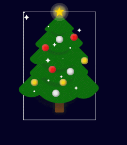
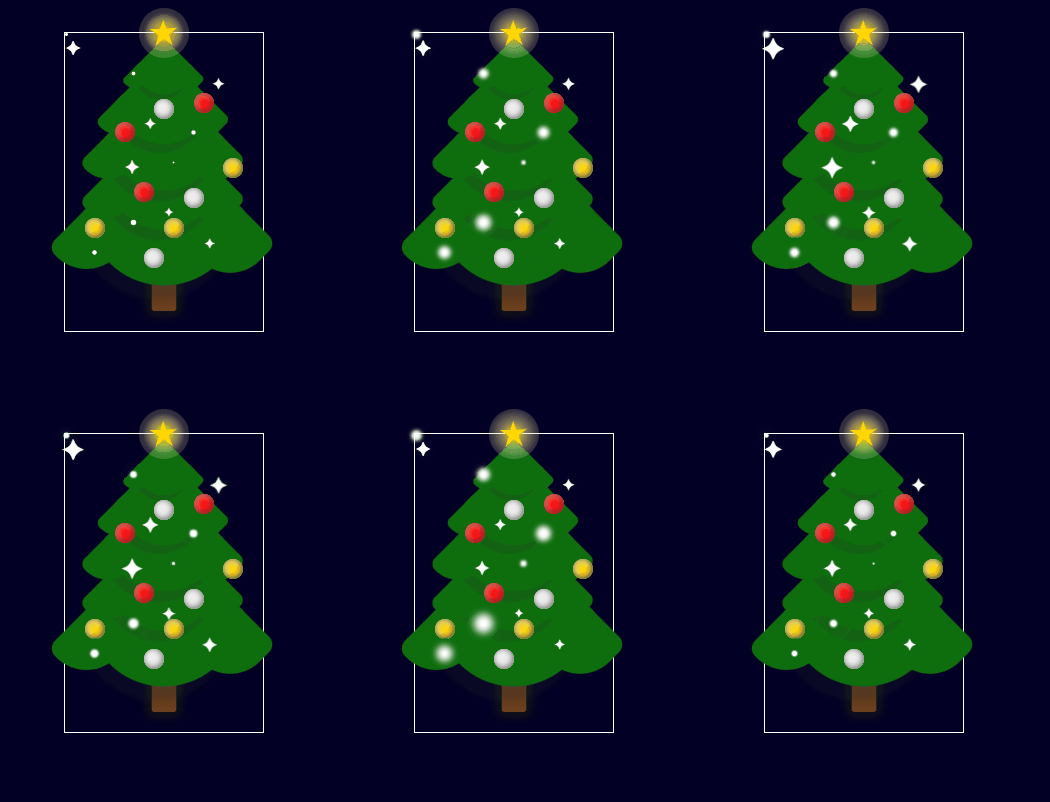
css3制作圣诞树

2021年12月19日 1703点热度

<!DOCTYPE html>
<html lang="en">
    <head>
        <meta charset="UTF-8" />
        <meta http-equiv="X-UA-Compatible" content="IE=edge" />
        <meta name="viewport" content="width=device-width, initial-scale=1.0" />
        <title>html+css制作圣诞树</title>
    </head>
    <body>
        <style>
            * {
                margin: 0;
                padding: 0;
                box-sizing: border-box;
            }
            body {
                background-color: #020024;
            }
            .word {
                font-size: 22px;
                text-align: center;
                color: gold;
                padding-top: 50px;
                letter-spacing: 5px;
                text-shadow: 2px 4px 9px rgba(255, 255, 255, 0.7);
            }
            .tree {
                width: 200px;
                height: 300px;
                margin: 80px auto 0 auto;
                position: relative;
                border: 1px solid white;
            }
            .star {
                width: 50px;
                height: 50px;
                position: absolute;
                background-color: #fff;
                border-radius: 50%;
                top: -25px;
                z-index: 1000;
                left: 50%;
                transform: translateX(-50%);
                animation: starLight 1.5s ease infinite alternate;
            }
            @keyframes starLight {
                0% {
                    background: radial-gradient(
                        ellipse at center,
                        gold 0%,
                        rgba(255, 240, 150, 0.5) 42%,
                        rgba(255, 242, 173, 0.2) 58%,
                        rgba(255, 255, 255, 0.1) 100%
                    );
                }
                25% {
                    background: radial-gradient(
                        ellipse at center,
                        gold 0%,
                        rgba(255, 240, 150, 0.5) 40%,
                        rgba(255, 242, 173, 0.2) 60%,
                        rgba(255, 255, 255, 0.1) 100%
                    );
                }
                50% {
                    background: radial-gradient(
                        ellipse at center,
                        gold 0%,
                        rgba(255, 240, 150, 0.5) 38%,
                        rgba(255, 242, 173, 0.2) 62%,
                        rgba(255, 255, 255, 0.1) 100%
                    );
                }
                75% {
                    background: radial-gradient(
                        ellipse at center,
                        gold 0%,
                        rgba(255, 240, 150, 0.5) 36%,
                        rgba(255, 242, 173, 0.2) 64%,
                        rgba(255, 255, 255, 0.1) 100%
                    );
                }
                100% {
                    background: radial-gradient(
                        ellipse at center,
                        gold 0%,
                        rgba(255, 240, 150, 0.5) 34%,
                        rgba(255, 242, 173, 0.2) 66%,
                        rgba(255, 255, 255, 0.1) 100%
                    );
                }
            }
            .star-in {
                position: absolute;
                left: 50%;
                top: 50%;
                border-right: 100px solid transparent;
                border-bottom: 70px solid gold;
                border-left: 100px solid transparent;
                transform: translateX(-50%) translateY(-50%) rotate(35deg) scale(0.14);
            }
            .star-in::before {
                border-bottom: 80px solid gold;
                border-left: 30px solid transparent;
                border-right: 30px solid transparent;
                position: absolute;
                top: -45px;
                left: -65px;
                content: '';
                transform: rotate(-35deg);
            }
            .star-in::after {
                border-bottom: 70px solid gold;
                border-left: 100px solid transparent;
                border-right: 100px solid transparent;
                position: absolute;
                top: 3px;
                left: -105px;
                content: '';
                transform: rotate(-75deg);
            }

            .leaf {
                position: absolute;
                left: 50%;
                top: 3%;
                margin-left: -30px;
                background-color: rgba(14, 110, 14);
                width: 60px;
                height: 60px;
                border-radius: 0 10px 35px 10px;
                transform: rotate(45deg);
                box-shadow: 2px 7px 2px rgba(43, 43, 43, 0.2);
            }
            .edge {
                position: absolute;
                left: 0;
                bottom: 0;
                background: rgba(14, 110, 14);
                width: 25px;
                height: 30px;
                border-radius: 0 10px 35px 10px;
                transform: translateX(0) translateY(50%);
            }
            .edge.right {
                position: absolute;
                left: unset;
                bottom: unset;
                top: 0;
                right: 0;
                background: rgba(14, 110, 14);
                width: 25px;
                height: 30px;
                border-radius: 0 10px 35px 10px;
                transform: translateX(50%) translateY(0);
            }
            .leaf:nth-child(eve) {
                background-color: #0f880f;
            }
            .leaf:nth-child(eve) .edge {
                background-color: #0f880f;
            }
            .leaf:nth-child(1) {
                z-index: 100;
                transform: rotate(45deg) scale(0.8);
            }
            .leaf:nth-child(2) {
                z-index: 99;
                top: 15%;
                transform: rotate(45deg) scale(1.3);
            }
            .leaf:nth-child(3) {
                z-index: 98;
                top: 28%;
                transform: rotate(45deg) scale(1.6);
            }
            .leaf:nth-child(4) {
                z-index: 97;
                top: 41%;
                transform: rotate(45deg) scale(1.6);
            }
            .leaf:nth-child(5) {
                z-index: 96;
                top: 54%;
                transform: rotate(45deg) scale(2.2);
            }
            .trunk {
                width: 25px;
                height: 45px;
                border-radius: 0 0 3px 3px;
                position: absolute;
                left: 50%;
                transform: translateX(-50%);
                bottom: 20px;
                z-index: 1;
                box-shadow: 0 0 10px 5px rgb(19, 19, 19);
                background: linear-gradient(0deg, #6d411b 0%, #5a341d 64%);
            }
            .ball {
                width: 20px;
                height: 20px;
                background-color: #f00;
                box-shadow: -1px -1px 6px inset #600, 1px 1px 8px inset #ffc9c9;
                border-radius: 50%;
                z-index: 101;
                position: absolute;
            }
            .b1 {
                left: 25%;
                top: 30%;
            }
            .b2 {
                left: 35%;
                top: 50%;
            }
            .b3 {
                left: 65%;
                top: 20%;
            }
            .b4 {
                left: 45%;
                top: 22%;
            }
            .b5 {
                left: 40%;
                top: 72%;
            }
            .b6 {
                left: 60%;
                top: 52%;
            }
            .b7 {
                left: 50%;
                top: 62%;
            }
            .b8 {
                left: 80%;
                top: 42%;
            }
            .b9 {
                left: 10%;
                top: 62%;
            }
            .b4,
            .b5,
            .b6 {
                background-color: #ececec;
                box-shadow: -1px -1px 6px inset #615f5f, 1px 1px 8px inset #fff;
            }
            .b7,
            .b8,
            .b9 {
                background-color: gold;
                box-shadow: -1px -1px 6px inset #3a3101, 1px 1px 8px inset #fff;
            }
            .sparkle span {
                display: block;
                position: absolute;
                font-size: 20px;
                z-index: 101;
                color: #fff;
                animation: lights 1.5s ease infinite alternate;
            }
            @keyframes lights {
                0%,
                100% {
                    transfrom: scale(1);
                }
                50% {
                    transform: scale(1.5);
                }
            }
            .sparkle span:nth-child(1) {
                left: 30%;
                top: 40%;
            }
            .sparkle span:nth-child(2) {
                left: 40%;
                top: 27%;
                font-size: 15px;
            }
            .sparkle span:nth-child(3) {
                left: 50%;
                top: 57%;
                font-size: 12px;
            }
            .sparkle span:nth-child(4) {
                left: 70%;
                top: 67%;
                font-size: 14px;
            }
            .sparkle span:nth-child(5) {
                left: 74%;
                top: 13%;
                font-size: 16px;
            }
            .blink div {
                width: 3px;
                height: 3px;
                background-color: #fff;
                z-index: 101;
                position: absolute;
                border-radius: 50%;
                animation: blinks 1.5s ease infinite alternate;
            }
            .blink div:nth-child(2) {
                left: 34%;
                top: 13%;
                transform: scale(1.2);
            }
            .blink div:nth-child(3) {
                left: 54%;
                top: 43%;
                transform: scale(0.6);
            }
            .blink div:nth-child(4) {
                left: 64%;
                top: 33%;
                transform: scale(1.4);
            }
            .blink div:nth-child(5) {
                left: 34%;
                top: 63%;
                transform: scale(1.8);
            }
            .blink div:nth-child(6) {
                left: 14%;
                top: 73%;
                transform: scale(1.5);
            }
            @keyframes blinks {
                0% {
                    box-shadow: 0 0 0 0 #fff;
                }
                25% {
                    box-shadow: 0 0 1px 1px #fff;
                }
                50% {
                    box-shadow: 0 0 2px 2px #fff;
                }
                75% {
                    box-shadow: 0 0 3px 3px #fff;
                }
                100% {
                    box-shadow: 0 0 4px 4px #fff;
                }
            }
        </style>
        <p class="word">merry christmas</p>
        <div class="tree">
            <div class="star">
                <div class="star-in"></div>
            </div>
            <div class="leaf-box">
                <div class="leaf">
                    <div class="edge"></div>
                    <div class="edge right"></div>
                </div>
                <div class="leaf">
                    <div class="edge"></div>
                    <div class="edge right"></div>
                </div>
                <div class="leaf">
                    <div class="edge"></div>
                    <div class="edge right"></div>
                </div>
                <div class="leaf">
                    <div class="edge"></div>
                    <div class="edge right"></div>
                </div>
                <div class="leaf">
                    <div class="edge"></div>
                    <div class="edge right"></div>
                </div>
            </div>
            <div class="trunk"></div>
            <div class="ball-box">
                <div class="ball b1"></div>
                <div class="ball b2"></div>
                <div class="ball b3"></div>
                <div class="ball b4"></div>
                <div class="ball b5"></div>
                <div class="ball b6"></div>
                <div class="ball b7"></div>
                <div class="ball b8"></div>
                <div class="ball b9"></div>
            </div>
            <div class="sparkle">
                <span>&#10022;</span>
                <span>&#10022;</span>
                <span>&#10022;</span>
                <span>&#10022;</span>
                <span>&#10022;</span>
                <span>&#10022;</span>
                <span>&#10022;</span>
            </div>
            <div class="blink">
                <div></div>
                <div></div>
                <div></div>
                <div></div>
                <div></div>
                <div></div>
            </div>
        </div>
    </body>
</html>
本作品采用 知识共享署名 4.0 国际许可协议 进行许可
标签: 暂无
最后更新:2021年12月19日
< 上一篇
下一篇 >
归档
  • 2024 年 11 月
  • 2024 年 8 月
  • 2024 年 5 月
  • 2024 年 2 月
  • 2023 年 12 月
  • 2023 年 11 月
  • 2023 年 9 月
  • 2023 年 6 月
  • 2022 年 12 月
  • 2022 年 11 月
  • 2022 年 10 月
  • 2022 年 9 月
  • 2022 年 8 月
  • 2022 年 7 月
  • 2022 年 6 月
  • 2022 年 5 月
  • 2022 年 4 月
  • 2022 年 3 月
  • 2022 年 2 月
  • 2022 年 1 月
  • 2021 年 12 月
  • 2021 年 11 月
  • 2021 年 10 月
  • 2021 年 5 月
分类
  • Android
  • Arduino
  • cordova
  • css
  • go
  • html5
  • JavaScript
  • nodejs
  • oracle
  • project
  • system
  • uni-app
  • vscode
  • vue
  • 学习计划
  • 摘抄
  • 随想

COPYRIGHT © 技海泛舟(个人技术研究). 2021-2023. ALL RIGHTS RESERVED.

Theme Kratos Made By Seaton Jiang

蜀ICP备2026065271号-1

蜀公网安备XXXXX号